
Color Blindness
Introduction
As you consider the design or curation of learning resources for your course, keep in mind that a significant number of learners may be color blind or have a color deficiency. Even though everyone views color differently, about one in 12 men is color blind according to the U.S. National Eye Institute. This number is much less for women; however, women experience color blindness as well. There are different types of color blindness, but generally, color blindness makes it difficult to distinguish different colors. The most common type of deficiency is red-green. Another type is blue-yellow (which is sometimes more accurately called “blue-green” deficiency). A small percentage of individuals can’t see color at all, but this is very rare.
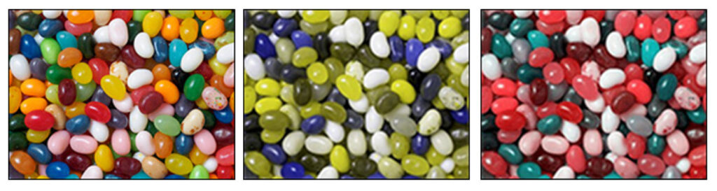
If you are not color blind or color-deficient, you may be curious about what someone with color blindness sees. In the images below, the image on the left is what someone without color blindness sees. The other images are what someone with red-green (center) and blue-yellow (right) color blindness sees.
A Closer Look
Color Blindness Test
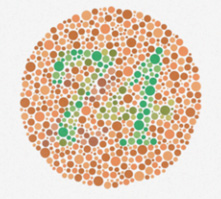
Testing for color deficiency is fairly easy, as demonstrated in a typical test for red-green color blindness. What do you see in the image below? If you see the number “74,” you are not color blind. If you see the number “21” or no number at all, you probably have some form of color blindness.
Design Issues Using Color
Consider these areas in course development where color is typically used to convey definition, meaning, or both:
- Charts and Graphs: When using color to separate data in a chart or graph, consider using texture (e.g., lines, dots, hash marks) in addition to or in place of color.
- Maps: Maps often use color to distinguish things like bus routes, highways, and rural roads, so use map colors selectively.
- Games: Games often use color to distinguish teams or differentiate other aspects of gameplay. When designing games for your course, consider using additional indicators to distinguish between objects, teams, and other elements.
When designing course pages, consider adopting the following measures:
- Avoid certain color combinations: These combinations include green-red, green-brown, blue-purple, green-blue, light green-yellow, blue-gray, green-gray, and green-black.
- Use high contrast: Color-blind learners can see differences in hue, saturation, and brightness.
- Use texture: In maps, charts, graphs, and infographics, include texture (e.g., lines, dots, hash marks) in addition to color to convey meaning.
Chart Example
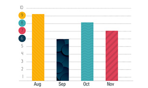
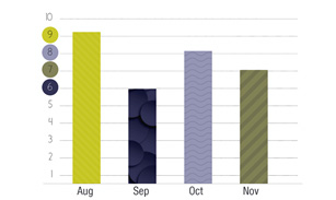
Charts and graphs are frequently used to convey data and, as such, should be designed to appeal to color-blind learners. The chart at the top is one example of how to design a chart for all learners. The image at the bottom is the same graph as seen by someone with red-green deficiency. Notice how the inclusion of texture makes the data points on the chart readable, regardless of color blindness.
 Additional Resources
- An Introduction to Color Theory for Web Designers by Envato Tuts+
- Coblis – Color Blindness Simulator by Colblindor
- Color Contrast Checker by WebAIM
- Colorblind Web Page Filter by Toptal
- Resources by We Are Colorblind